 monthlet
monthlet is a note app where you write and grow notes through AI chat.
Writing numbers down in a note is easy enough, but turning them into a chart usually means opening another app. You build it in a spreadsheet, export an image, and paste it into the note. When the numbers change, you repeat the whole sequence.
In monthlet, a chart is a block inside the note. You ask for it in chat, and it is placed in the note.
Asking in chat
Open the note where you want the chart and ask in chat.
Ordinary phrasing works: “make a bar chart of sales,” “show the trend as a line,” “make the breakdown a pie chart.” You can name the chart type or leave it out. “Turn these numbers into a chart” is enough — a type that fits the content is chosen for you.
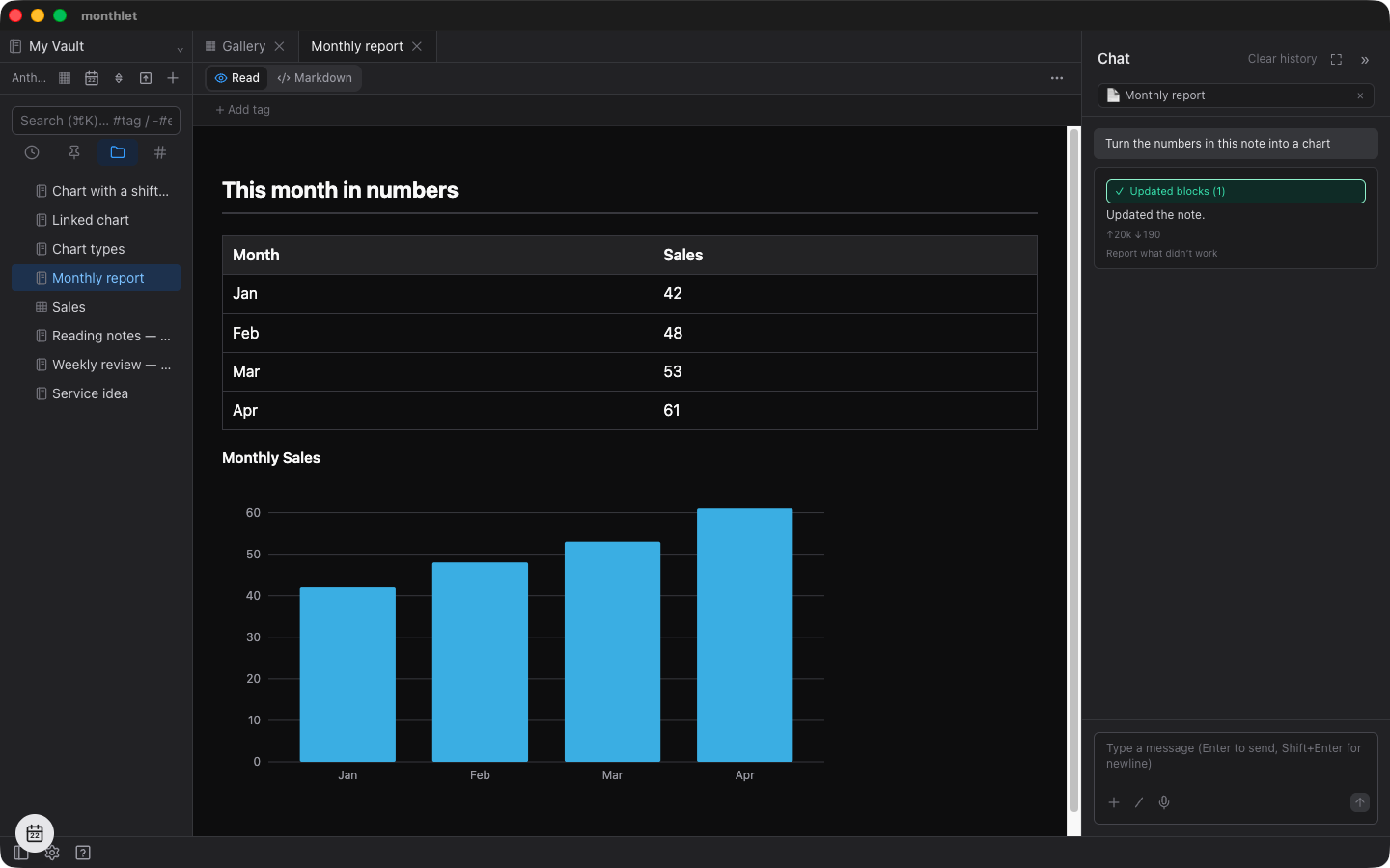
The numbers can come from the note itself or from a separate spreadsheet. The sheet does not have to be open; you can point to it by the file name of the note or spreadsheet.
Choosing among the 11 chart types
Eleven chart types are available at the moment. Three of them — 100% stacked bar, stacked area, and lollipop — were added in v0.17.0.
For comparing magnitudes, use a vertical bar chart or a horizontal bar chart. Horizontal bars suit long labels and ranking displays. A lollipop chart is close to a bar chart, and works well when listing KPIs.
For change over time, use a line chart, an area chart, or a stacked area chart. An area chart shows the trend and the accumulated quantity at the same time. A stacked area chart shows the trend of the series summed together.
For breakdowns, use a stacked bar chart, a 100% stacked bar chart, a pie chart, or a doughnut chart. The 100% stacked bar normalizes each label’s total to 100%, so it shows only how the composition shifts; differences in total volume are not represented.
A radar chart is for comparing across several axes at once. It needs at least three axes.
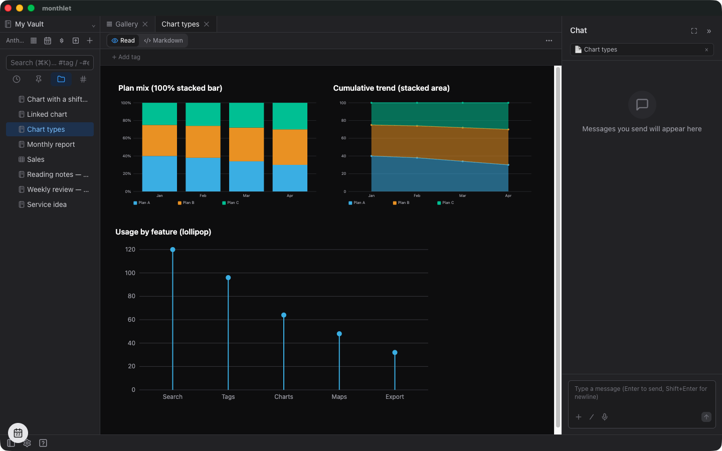
Chart type names are matched loosely. An English abbreviation for a horizontal bar, or an alternate spelling of “doughnut,” is understood as the same thing. If the name cannot be resolved, the default bar chart is used.
Linking a chart to a sheet
When you build a chart from spreadsheet numbers, the default is a one-time generation that captures the values as they were when you asked in chat. Editing the sheet afterwards does not change the chart. To bring it up to date, you ask again.
If you want the chart to follow the sheet every time you edit it, include the word “link” in your request — for example, “make a chart linked to the sales sheet.”
A linked chart shows a small 🔗 in the top right. Edit and save the source sheet, and the chart’s values are recalculated. Clicking the 🔗 opens the linked sheet as a tab. Hovering shows where it points.
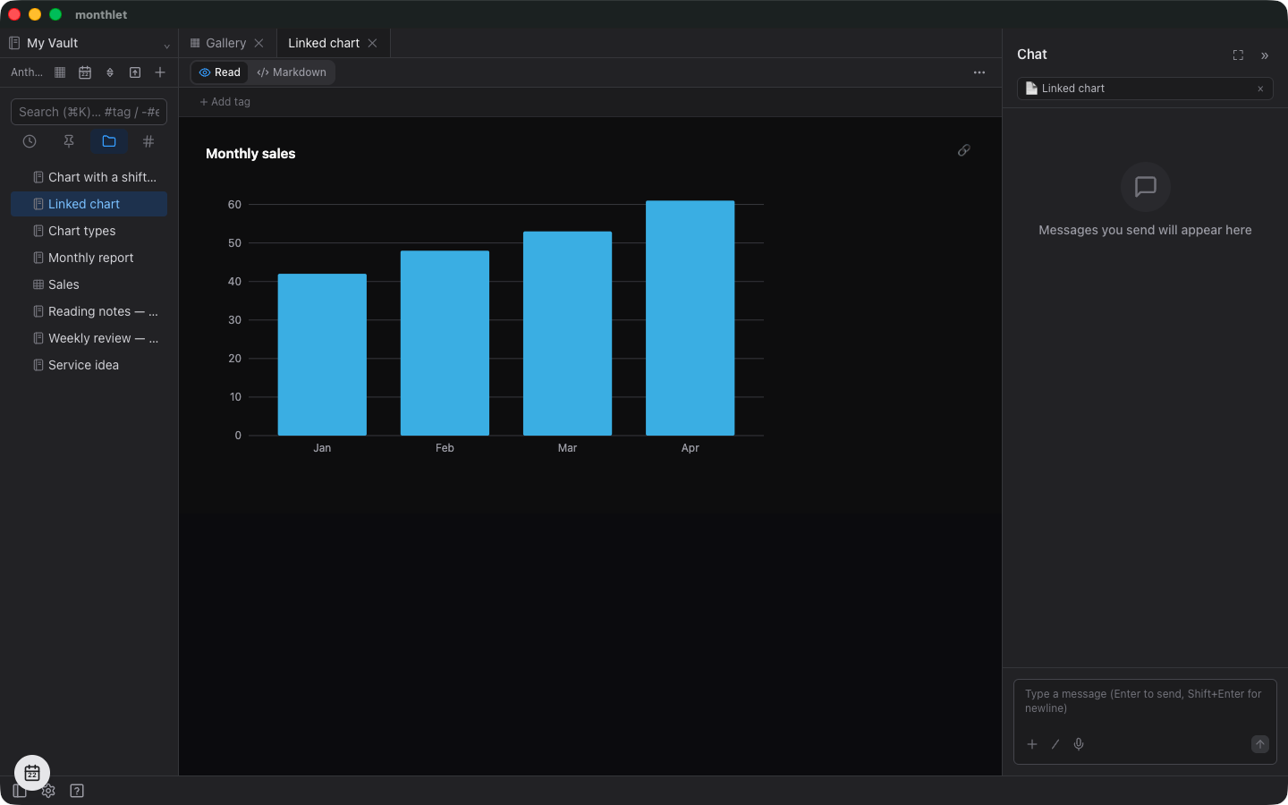
Charts update even when the note containing them is not open. For a closed note, the file itself is rewritten after the sheet is saved, so the values are current the next time you open it.
Some charts cannot be linked. An example is “sales by product” built from a line-item sheet where the same product is scattered across many rows — a chart whose shape cannot be reproduced by reading a sheet range as-is. In that case the chart is created as a one-time chart and gets a 🔗 with a slash through it in the top right. To make it linked, first build an aggregated table on the sheet, then ask for a chart linked to that range.
How a range is read
The link target is specified as a sheet range. The first row of the range is the series names, the first column is the labels, and the rest are the values.
Cells containing formulas are read as their computed results, and cells with currency symbols or thousands separators are read as numbers.
Markers when a range shifts
Ranges are not automatically tracked against structural changes in the sheet. Inserting rows or columns shifts what the range points at.
When a shift may have occurred, a marker appears. If the labels or series names differ from before, a ⚠ is added to the top right of the chart and a warning-colored line is shown along its left edge.
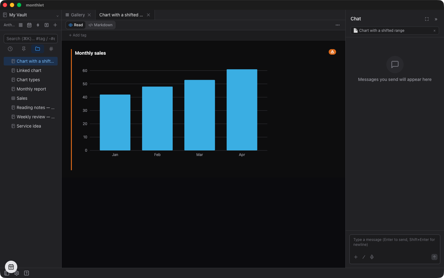
In that state, the numbers displayed are the ones from the last time the range was read correctly. Values read from the shifted range are not substituted in. To rebuild it, ask in chat to recreate the linked chart.
If the structure returns to its original form and the range matches again, the ⚠ disappears. The 🔗 with a slash through it stays until the chart is rebuilt and the link is established.
Series colors are assigned automatically
You do not specify series colors. Seven prepared colors are assigned in order, and the sequence starts over once they are used up.
This palette is kept separate from the theme colors. A theme carries brand colors, which were not chosen to be distinguishable from one another. Extracting “colors that can be told apart” from the bundled themes yields only three to five colors, short of the seven needed. So a palette aimed solely at distinguishability is kept separately for charts. It is based on a categorical palette designed with color vision differences in mind, and uses different orderings for light and dark screens.
Axis, tick, and caption colors follow the theme. If the theme carries its own chart palette, that one takes precedence.
No charting library is used
Charts are drawn by assembling SVG on the spot. Small helpers for computing tick positions and curve shapes are used, but nothing that takes over the drawing itself. What comes out is an SVG string.
Charts are composed at 640 × 360 and scale to the available width when displayed.
Because no JavaScript is involved in displaying a chart, charts appear as-is when a note is exported as an HTML file, and they appear in list thumbnails as well. Opening the note in a browser looks the same as opening it in monthlet.
Only the part where clicking the 🔗 jumps to the sheet is an in-app function, so in an exported file it is display only.
Scatter plots are not there yet
Chart data is held as a list of labels and a list of series. A series is a name plus a list of numbers. All eleven types draw that shape directly. The 100% stacked bar only normalizes totals to 100, and the stacked area only stacks the areas; the underlying data is unchanged.
A scatter plot cannot be drawn from that shape. It needs pairs of x and y, which would mean changing how the data is held. Changing that affects how already-saved notes are read. That needs careful design work, so it is not implemented yet.
Try it
monthlet is currently distributed for macOS (Apple Silicon). A Windows version is in preparation. Enter your own AI API key and all features are available.
-
Download: https://monthlet.ai/download
-
Discord: https://discord.gg/aP4Hc7cJGU